Displaying forecasts on the chart
BeginnerThe essentials
When a GRIB is displayed (tap its row in the “GRIBs” tab of the left drawer), the chart shows the wind by default: a color map according to its strength, and animated particles or barbs for its direction. Everything else in the file (gusts, pressure, rain, clouds…) is one gesture away.
- Tap the round orange layers button at the bottom right of the chart.
- In the “Forecast display” section, choose the parameter in the drop-down list (“Wind” by default).
- Check or uncheck “Color map”, “Particles” or “Barbs” (“Arrows” for currents and waves), and “Isobars”.
- Drag the timeline at the bottom of the screen to follow the evolution hour by hour.
- Read the values in the badges at the top of the chart: they give the forecast under the target (by default, the crosshair at the center of the screen).
The fine settings (color style, transparency, particle density…) are in the right drawer, “Forecast display”.
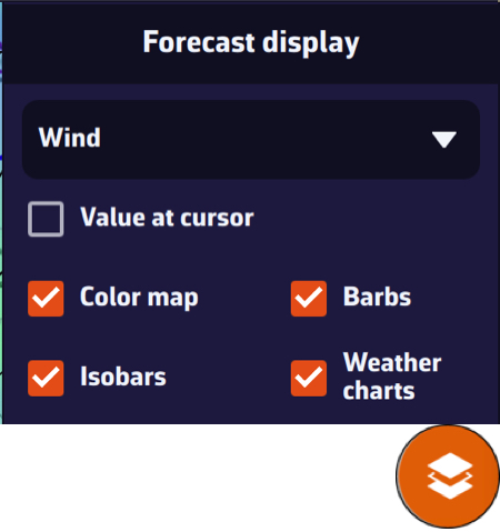 Layers menu, Forecast display section: Wind parameter, Value at cursor, Color map, Barbs, Isobars and Weather charts
Going further
The parameters in the list
The list only offers what the file contains, in this order:
- “Wind” and, for an ensemble model, “Wind Spread” (the standard deviation of the wind between the members);
- “Gusts” and “Delta Gust” (the difference, in knots, between the forecast gusts and the mean wind: the larger it is, the more the gusts exceed the mean wind). “Delta Gust” is very useful for anticipating sail changes: sails are often chosen by the gusts rather than by the mean wind, especially on a multihull;
- “Pressure” and, for GEFS, “Pressure Spread”;
- “Currents” and “Waves”;
- “Temperature” (air), “Precipitations”, “Cloud” (cloud cover), “CAPE” (energy available for thunderstorms) and “Snow”;
- and, for an imported file that contains it, “Ice” (sea ice, in %).
NavimetriX remembers the chosen parameter for each GRIB. If a parameter is missing, check that it was ticked at download time.
Barbs, particles and arrows
- Particles: thin animated trails that follow the wind, computed by the graphics card. This is the default mode. They are black, or white on the BING background.
- Barbs: the classic meteorologists’ representation, arrows placed on the points of the GRIB grid, spaced further apart as you zoom out, with barbs that show the wind strength. More sober, they are also easier on the battery.
- Arrows: for currents and waves. See Currents and Waves and sea state.
The choice between particles and barbs is made in the settings, on the “Wind display” row; the checkbox in the layers menu then takes the name of the chosen mode. It applies to the wind and what derives from it (gusts, Delta Gust, Wind Spread), to currents and to waves; it has no effect on pressure, temperature, rain, clouds and CAPE.
The “Forecast display” settings
Open the right drawer with the chevron handle (‹) at the right edge of the screen, then “Forecast display”. The page has one section per family of data.
Wind (also applies to gusts):
| Setting | Values | Default |
|---|---|---|
| “Wind display” | “Particles” or “Barbs” | Particles |
| “Particle density” | 25 to 300%, in steps of 25 | 100% |
| “Particle length” | 25 to 150%, in steps of 25 | 100% |
| “Color map style” | “Gradient” or “Iso areas” | Gradient |
| “Land mask” | on or off | on |
| “Transparency” | 0 to 100%, in steps of 5 | 50% |
| “Iso areas step” | 1 to 20 knots | 5 knots |
Pressure: “Color map style” (Gradient by default), “Isobars step” (1 to 5 hPa, 2 hPa by default), “Smooth isobars” (on by default) and “Transparency” (50%).
Precipitations, Temperature, Cloud and CAPE: a single row, “Transparency” (50% by default).
The Currents, Waves and Lightning sections are described on their own pages: Currents, Waves and sea state, Lightning and thunderstorms.
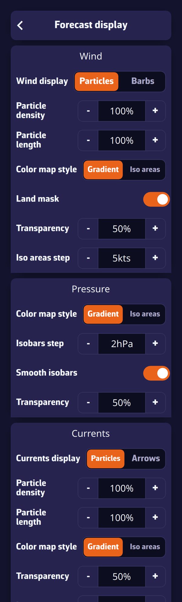 Right drawer, Forecast display page: Wind, Pressure and Currents sections
Color map and iso areas
- Gradient: the color varies continuously with the value. For wind, the scale runs from blue (calm) to magenta (strong wind) through green, yellow and red, over 0 to 40 knots.
- Iso areas: the same scale, but in bands of equal value (for example every 5 knots with the default step), up to 50 knots for wind. The “Iso areas step” setting sets the width of the bands.
- Rain is always painted in bands, from 0.1 to 50 mm/h. Temperature runs from purple (−20 °C) to red (+40 °C), CAPE from yellow to dark red (0 to 4,000 J/kg), and clouds from transparent to dark grey.
- Transparency sets how much of the chart remains visible under the color map: at 0%, the color is opaque.
With the “Colorblind-friendly colors” setting (Settings, “General”), the wind scale drops the green. There is no legend on the chart: the exact value is read in the badges. At very high zoom levels, as soon as the chart shows a harbor, the color map fades out.
Land mask
When on (the default), the land mask hides the wind color map and barbs over land. It applies down to the harbor-approach view, a few miles across. Turn it off to see the wind over land too, for example among islands where you want to keep a sea-to-land continuity. Wave colors, on the other hand, are always masked over land.
Isobars
The “Isobars” checkbox in the layers menu only appears if the GRIB contains pressure. Off by default, it draws lines of equal pressure over the displayed parameter, whichever it is: wind and isobars together, for example. The spacing between two lines follows the “Isobars step” setting. Labels give the pressure along the lines (reddish below 1,013 hPa, bluish above, in your pressure unit), and the letters H and L mark highs and lows. Isobars fade out at very high zoom levels and while a routing is being computed.
Reading the values: the target and the badges
The row of badges at the top of the chart gives, for each parameter of the GRIB, the value under the target, at the time of the timeline: wind (strength and direction), gusts, pressure, temperature, rain, clouds, CAPE, snow, current, waves (height, direction, period). “—” means there is no value at that location. For an ensemble model, the spread is followed by the symbol σ (standard deviation).
Tap a badge: a curve of that parameter over the whole duration of the GRIB, at the target point, appears under the badges. Tap it again to hide it. To see all the parameters at once, as a table, see the Meteogram.
The “Target” list in the layers menu chooses the point that is read: “Screen center” (the default), “GPS position”, one of the visible POIs, or “Disabled” to hide the badges.
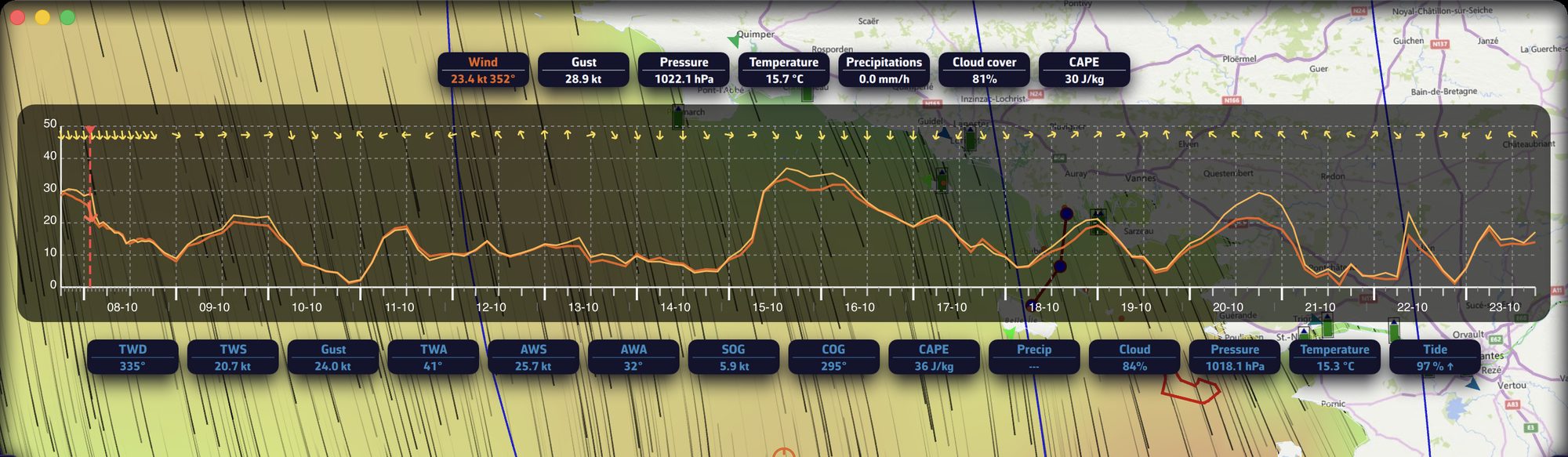 The “Wind” badge tapped: the wind and gust curve over the whole forecast
Value at cursor (computer)
On a computer, the “Value at cursor” checkbox in the layers menu shows, next to the mouse pointer, the value of the displayed parameter at that spot: direction then strength for wind, height, direction and period for waves. It is off by default, and disappears while the chart is being moved, over a clickable object and outside the GRIB area. It does not exist on touch screens.
The timeline
Drag the timeline (or use the mouse wheel) to move from one forecast time to the next; all the weather layers follow. Tap the time bubble to return to now. The play button loops through the forecast, over the duration of the GRIB (or of the displayed routing).
Energy saving
The “Energy saving” setting (Settings, “General”) replaces particles with barbs for the wind and with arrows for currents, and greys out the corresponding rows of “Forecast display”. It does not exist in the browser version.