Numerous weather surface analysis maps, also known as isobaric or fronts maps, are available in the application to supplement GRIB files and facilitate the interpretation of weather situations and forecasts.
These charts come from various meteorological agencies and are produced by forecasters: NOAA (USA), Met Office (UK), BOM (Australia), Marinha do Brasil (Brazil). A special chart for observing Sargassum off the coast of the Caribbean is also provided by USF (University of South Florida). All are stored on our own servers.
Open the left panel with the chevron handle (›) on the left edge of the screen, then select the Charts tab.
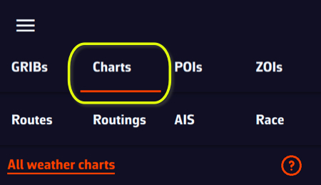
The chart list is dynamic: it only offers the charts that cover the centre of the screen. Move the map to see those of another region. The All weather charts link at the top of the tab opens the full list on our website.
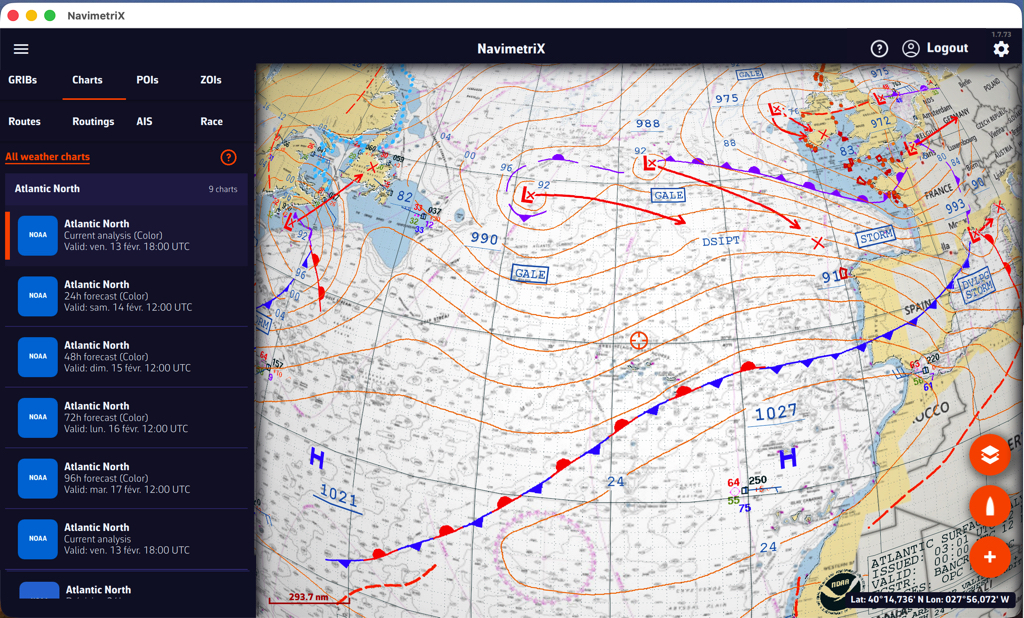
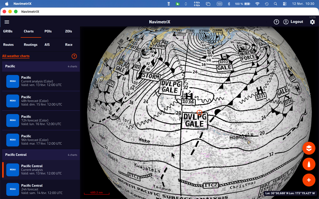
Displaying NOAA weather maps
NOAA maps range from the current analysis up to 48-hour forecasts in colour. A few black and white charts go further: 72 hours for the tropical Atlantic and the central Pacific, 96 hours for the North Atlantic and the North-West Pacific.
Overlaying NOAA weather maps with GRIBs
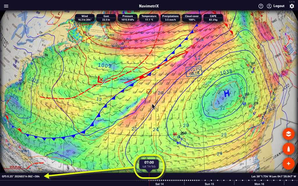
Overlaying the NOAA map with the GFS file provides additional insight with the drawing of fronts and specific annotations.
Displaying Met Office and BOM weather maps
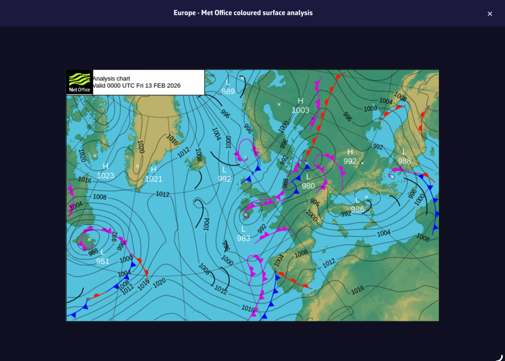
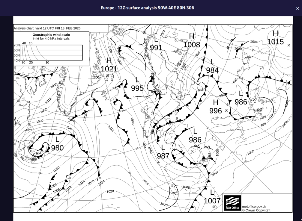
Met Office maps are not in a format that allows them to be overlaid on the nautical chart in 3D. They are therefore displayed in their original format, in colour or black and white. They only cover the North-East Atlantic and Europe. They range from the current analysis up to 5-day forecasts.
BOM analysis charts (Indian Ocean, South Pacific, Australia) open the same way, in their original format.
The South Atlantic
The Marinha do Brasil surface analysis covers the South Atlantic, from 90W to the Greenwich meridian and from 20N to 70S. It is displayed on the nautical chart like the NOAA charts.
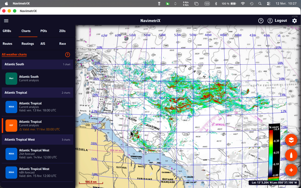
Sargassum map
Published by the USF, the sargassum density map covers the eastern Caribbean, from 63W to 39W and from 10N to 22N. It is updated daily. It is mainly of interest for crossings to the West Indies.
Satellite images
Three types of satellite images are available, covering the entire world. They are taken from different weather satellites and provide a near real-time view of cloud cover.

Tap or click the round orange layers button and tick Realtime Satellite in the Maps section.
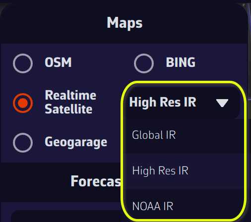
High Res IR, Global IR, and NOAA IR are combinations of infrared images that show cloud cover. By combining a satellite image and an isobaric map, you can obtain an instant view of weather conditions.
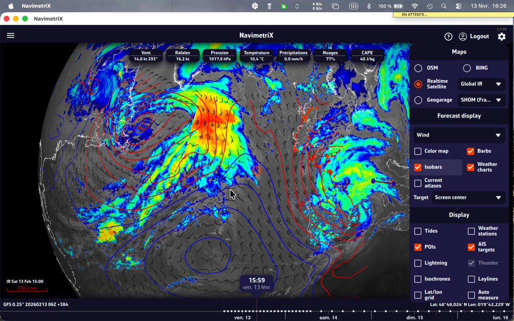
You can also add thunder and lightning displays!
The colour coding of precipitation totals on radar images follows the scale below (source: Météo-France):

For information on interpreting frontology (isobaric) maps, see this FAQ: How to read marine weather maps.